Games like Joking Hazard often get treated with casual disdain in the hobbyist game reviewer space. ‘Not really for us’, we sniff while quaffing vintage meeples from a plastic goblet. ‘Gauche. Vulgar. Base. Low art’, we sneer while liberally loading refined d20 pate onto cardboard crackers. And yet, these games are popular in a way that most games cannot ever hope to be, because they forgoe the obsession with mechanical engineering and just give people a chance to have fun. Remember fun? It was huge in the eighties.
And I’m no better in that regard. This whole review corner of this blog is me being impossibly haughty about a topic that doesn’t matter at all. It’d be comical if it hadn’t occupied literal thousands of hours of my life at this point. A new colleague and I were chatting about ‘important published papers’ last week. My answer was ‘I work in games. I’ve never published an important paper in my life’.
What is important though is accessibility, even in areas where it might seem utterly frivolous. Society doesn’t get to decide that being able to participate in some hobbies is optional, at least not without someone like me yelling into the void about it. So let’s see if Joking Hazard gives me something to shout about.
Colour Blindness
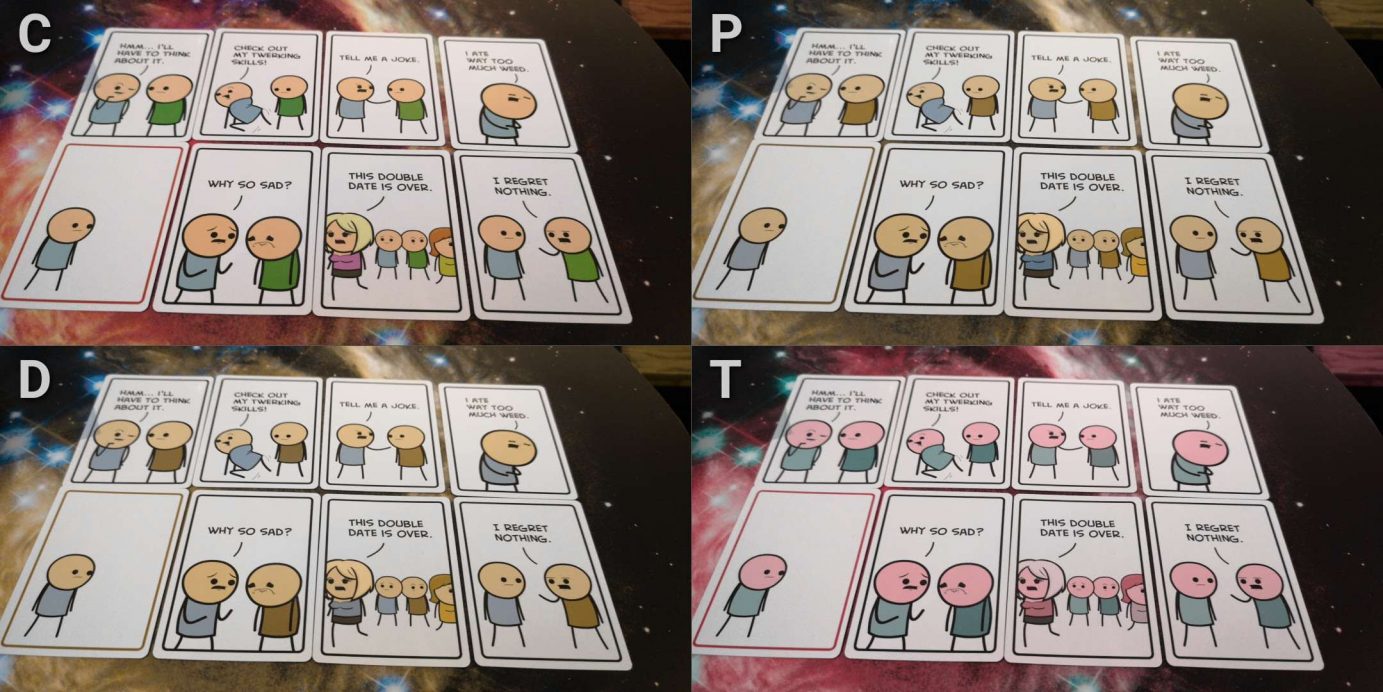
It’s a bit of an issue here, but only really for Tritanopes and only in a small way. The two main characters are identical except for the colour of their tops. One is light blue, the other green, and in poor lighting conditions they can be difficult to tell apart for some categories of colour blindness.
The mechanical impact of this is that dialog might be tricky to properly line up. It’s already difficult to an extent, matching punchline to the character making comments, but it’ll be a little more difficult for some to do that consistently without relatively close inspection. They are different, just not as different as would be ideal.

The usual solution would be to add a texture as well as a colour, but an interesting issue here is that this is an adaptation of an existing comic property and as such it has to match with the aesthetic of the original. What makes this distinctive is the lack of a comedy throughline that reinforces context. In the written comic you’d be guaranteed that dialog is attributed in a call and response style. In the game, each panel has no context other than what it has on the table. Just because blue did the setup, it doesn’t mean you’ll have a card where green delivers the punchline.
There is some good news though, although I can’t guarantee this is honoured as part of the game and all expansions. The blue character is, as best I can tell, always on the left. The green character on the right. The way characters are facing, when there’s only one of them, is towards the other. So if you have one character on a card looking right, it’s almost certainly the blue one. The only time that’s not reliable in when something odd is happening in frame, like the blue character sitting on top of the green one. Even then you can infer through orientation which is which.
As I say though, I don’t know if this is a quirk of the comic or an intentional, formal standard. And I don’t know if expansions would change that. It does though mean that the game is fully playable with people with colour blindness, except with a little extra cognitive load for those with blue-green colour blindness.
There’s another small issue in that some cards are ‘punchlines’ and have a red border rather than a black one, but that’s not an issue for any of our standard categories that we examine and can be resolved through verbalisation when a punchline is revealed.
We’ll recommend Joking Hazard in this category.
Visual Accessibility
Joking Hazard works like Cards Against Humanity in that every single part of the joke can be verbalised. It’s just… not going to be as much fun.
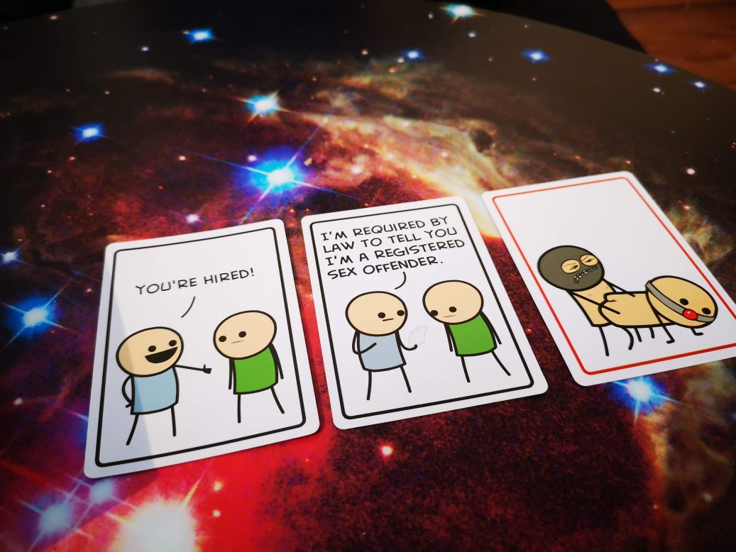
Consider the panels below:

You can verbalise this easily enough. ‘Blue says ‘You’re hired’’, next panel ‘Blue says I’m required by law to tell you I’m a registered sex offender, green is downhearted’, final panel is ‘Blue, presumably, is sodomising green. Blue is in a gimp mask, green is in a ball gag’
And yeah… all information has been conveyed. There’s a tempo and style of gathering visual information though that doesn’t map onto text. It’s like explaining a joke – something gets lost in translation.
But there’s a bigger problem than that.
Since each player has a hidden hand of cards that are comic panels, and are trying to find one (or two) cards that match another card – it’s hard to work out a way that could be done fluidly when someone has visual impairments of moderate severity. You can’t really play open, because the judge has to pick the funniest based on an element of secrecy. Plus, every punchline would already be out there in the game. A joke is basically two stories, one doing a setup and one subverting that setup. It’s hard to subvert something when you know all the possible directions it could go.
So, it’s probably not playable for people with visual impairments because of the hidden hand of cards, and even if it was playable it’s probably not going to be very funny. Cards Against Humanity and Funemployed both work better in this category because all the funny happens in your head, and text is amenable to close inspection in a way graphical panels aren’t.
We don’t recommend Joking Hazard in this category.
Cognitive Accessibility
The panels in Joking Hazard aren’t exactly high-brow, and the game doesn’t have a lot of rules. As discussed in the review, the idea of it having rules at all is something of a faith-based proposition. It’s just an excuse to sit down with friends and have a laugh without anything complicated being involved.
That said, there are some concerns here.
The first is that the shift from needing funny cards to needing funny people puts a bigger cognitive load on everyone than Cards Against Humanity. The judge needs (usually) to put together an effective setup. Everyone else needs an effective punchline, and ideally one that ensures coherence across the three panels. You want to make sure dialog matches, and that the conclusion of the three panels raises a laugh. You only have seven cards in hand with which to do it though so it’s not an easy proposition.
The good news here is that you can play cards down at random and you’re technically playing. It’s just you’re not winning. Or, more importantly, you’re not making anyone really laugh.
The need for literacy is quite high, because a lot of the comedy that the game enables is in the form of wordplay and visual comedy based on wordplay. Situational knowledge is needed for a lot of the game. For example, the crucifixion puncline card is only likely to be funny if the setup can reference Jesus or the Romans in some way, and that requires not only a fair understanding of Christian history but also the knowledge that the judge will have a similar understanding. Not all the cards are that esoteric, but comedy comes in large part from a shared context and an unexpected exploration of that context.

All the cognitive costs here come from trying to be funny within the constraints of the card, and that’s quite a lot to ask. There aren’t many specific worries for those with memory impairments only – it’s not useful to know there’s a great punchline in the deck if it’s not in your hand, for example. As such, we can’t recommend it in our fluid intelligence category but we’ll recommend it for those with memory impairments only.
Emotional Accessibility
Unsurprisingly, this is a game that has the potential to open up a lot of wounds at a table. Jokes tend towards the sexual and transgressive, and with any game where juxtaposition is an element it’s not possible to simply remove all the ‘bad’ cards. If someone wants to make a comic about child abuse, you bet your bananas they can regardless of what you leave them with in the deck.
The consequence of this is that anyone with a hidden trauma that they don’t want to potentially have as a topic of comedy will struggle at times. And revealing that trauma may not be appropriate, possible, or even a good idea. If someone says they want a particular topic to be off limits, and if everyone agrees, it then becomes the elephant in the room of which everyone has to be wary. Check out our teardown of Cards Against Humanity for a full discussion of this issue. It’s mostly the same here, just with comics.
I will say though that this is a tamer version of Cards Against Humanity. Shock value is what drives a lot of the card choice in CAH and while there are cards in here that are explicitly designed to be extreme there are fewer of them and the extremeness is a lot less notable. They’re less obviously racist, less obviously sexist, and less obviously based on temporary memes.
We don’t at all recommend Joking Hazard to people who might have issues in this category, but we’d recommend it over CAH.
Physical Accessibility
Provided players have access to a couple of card holders, playing Joking Hazard should present no real obstacle. As long as cards in the centre of the table are visible, everything else can be dealt with by indicating a card to be played from the rack. Or in some cases, two cards and the order in which they should be laid down.
We’ll recommend Joking Hazard in this category.
Socioeconomic Accessibility
The language used in the rules is gender neutral.
It seems weird to say it, but Joking Hazard kind of has an inclusivity thing going on in its card designs. The two main characters in the game are not explicitly gendered – they are men or women or neither depending on the circumstances. They are explicitly heterosexual or homosexual in some panels, but not many. There are some women characters that appear in some of the cards, which does tend to imply they are male by default, but a case could be made either way. A lot more of the cards though do imply male genetalia than otherwise, so…
They are also overwhelmingly white, but again that’s something that’s necessary (to an extent) to conform to the original webcomic.

It’s not especially cheap at an RRP of approximately £25 but you do get a lot of cards and the frame for reference for the cost, as well as much of the game, is Cards Against Humanity. That also has an RRP of around £25. Insofar as CAH offers value for money, so does Joking Hazard. In fact, since a print and play verison is available, it’s actually easy enough to make your own for pennies on the pound.
We’ll recommend it here.
Communication
It’s really good if the judge can read out the text of each card as it’s played, but it’s not a mandatory part of the experience. You can play in complete silence if you like, but the fun is enhanced by someone acting as narrator of the panels. Ideally with funny voices.
Literacy is required, and some of the language is quite sophisticated making use of wordplay, implication, inference and more. A good command of the language the game is employing will be necessary to get the most out of it.
We’ll tentatively recommend Joking Hazard in this category.
Intersectional Accessibility
I’m not really sure there are many to cover here. Colour blindness of the type discussed in that section combined with physical impairments will have a slight impact on the ease with which players can close inspect, but for all the cards for which that might be most necessary they’ll be open information and can be verbally outlined instead.
Joking Hazard plays very quickly, and really it lasts as long as you want it to. Standard rules are to play until you’ve won three punchlines, but there are plenty of variants available and you can just go with whatever you like. It supports players dropping in and out, doesn’t take up a lot of table space, and generally doesn’t put any stress on anyone. It’s a very easy going, casual game.
Conclusion
A graphical version of Cards Against Humanity was always going to suffer in some of these categories. I suspect you’ll never find a game about making dark juxtaposed comedy that is also emotionally accessible. I can’t even visualise how that would possibly work. So some of these grades for Joking Hazard just won’t a surprise to anyone.
Jokes often don’t survive transposition too – from comic to text – which makes some technically acceptable solutions (verbalisation) inappropriate because of information loss. The more you need to interrogate comedy beyond its initial presentation, the less funny it will end up being. Even if you could play the game with the cards in your hand, I suspect you wouldn’t want to if someone had the job of explaining every panel in a way that could be visualised.
We gave Joking Hazard three stars in our review, but come on – it just doesn’t matter for this kind of game. It’s not supposed to be elegant, well designed, original or creative. It’s just supposed to be fun. It accomplishes that well enough.
I would recommend Funemployed as the best of this style of game, accessibility and fun wise. Wall to wall it’s a more interesting, effective design. But on the flipside it doesn’t have cartoon figures performing violent buggery or self-fellatio, so you know – go with whatever one appeals most to your sensibilities.

